Web Site for Kindermusik Ithaca
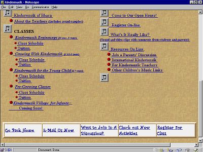
The Kindermusik site contains the following pages:
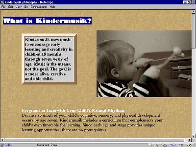
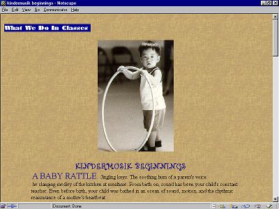
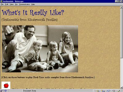
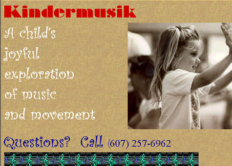
The web site complements other promotional literature, which includes flyers and brochures, some from the parent international organization and one produced locally that includes current class schedule and tuition information. The target market has a very high percentage of web access, either at home or work (estimated at over 75 percent). The web site will be promoted in all posters and brochures distributed and client is in process encouraging other local sites to add pointers to Kindermusik Ithaca, as appropriate. Design Issues Navigation: The main page is designed to provide a jumping-off point to specific information the user may be interested in. At the portal there there is a clickable menu of information available at the site. At the bottom of this and every page are the five navigation buttons expected to be most useful: HOMENew site visitors should be able to easily locate specific information or browse the site. Regular visitors should be able to quickly access information (like home activities, which will be updated monthly) and interact with teachers and other parents via e-mail or chat. Text Font and Graphics: Site is text-heavy as appropriate, especially on pages like Our Philosophy. Information is there for those who want it. Heads are in Curlz MT, with running heads using Braggadocio text reversed out of a blue box. Running heads were designed to link related pages (What We Do in Classes, for example) but these probably need further examination. Photos: Includes photos to help promote, persuade, and tell what Kindermusik is all about. Images are chosen for ease of "readability" on a web page, in fairly small size. All are sepia-toned, including several color photos I ran through Photoshop to color-correct. They are inserted into tables, to facilitate size manipulation. I took all photos, so there are no issues of copyright. (However, it might be nice to give myself a credit somewhere.) Background/Colors: Since I wanted a very slight textured feel ("quality" idea), I imported the background, but couldn't figure out how to revise color (in Photoshop or elsewhere!). To complement sepia-toned photos, color background should really be closer to first version (deep peach). Navy, dried-blood red,olive-green, and white r.o. type colors all chosen for legibility against background color. Sound/Video/Animated GIFs: For those users who have powerful machines and like bells and whistles, there are some sound and video clips. But of course, the site is designed to be effective for those who can't access these things, too. The sound clips are used to hear both teachers describing why they got into teaching Kindermusik (less than 60 seconds each) Both teachers have a genuine enthusiasm for what they do that is important to convey to potential students/families. (It also personalizes the site.) For those who cannot play audio, there is a link to a text-only version of the statement. Videos will be used on each class description page, and will include clips under one minute each from a class of students in that age range. No text version is available. Access is via animated clickable GIF of video screen. Mail/Chat/Registration: Visitors will be able to join a chat/discussion group, send e-mail, and register for classes. Upkeep Issues: Client anticipates checking e-mail daily and responding within several days, updating the activities page monthly, inputting new schedules for the semesters as they are arrived at (new pages may be necessary, if she chooses to provide current and upcoming schedules). In addition she will monitor chat/discussion forum and incoming registration forms as appropriate. In an ideal world, design would be much more visual (and aural--especially since this is a music-related site), with first page, for example, featuring for impact a full-screen photo with text ("KINDERMUSIK--A child's joyful exploration of music and movement") reversing out. It would automatically play the first 20 seconds of the "hello" song, which is traditionally used to open classes. Other sounds would play as you opened other pages, for example, a little kid saying, "Mommy, is this a Kindermusik day?" The musical instrument page (to come) would feature clickable representations of each instrument, with sound bites for each. More and longer video would be used, with real-time streaming to allow clips of up to three minutes of class demos and other places where appropriate. Given that the audience (and
my client!) do not, for the most part, have T-1 internet access this first
edition of the Kindermusik page--alas!--keeps "bells and whistles" to a minimum.
©TLC Productions 1999. All rights reserved. | |||||||||||||||||||||||||||||||
